|
By Jeni Gearhart I like color (and coloring books but that is beside the point). My classroom is covered in color from student projects. On occasion, my teaching wardrobe is too colorful. I say all of this because in the last few years, I have discovered the importance of visual argument in the classroom. Much of this new love of visual has come from AP workshops and creative teacher friends that I follow on Twitter. So, why is this important? If we use visuals well, it can become more than making a project “pretty”. It should be a part of the argument itself. In an increasingly visual society, students should be learning how to use the medium well (and understand how others are using it to influence them). Here are two things that I used this year that worked well. The first is low tech (hello art supplies!). The second is high tech but can be managed with art supplies if computers are inaccessible. Literary Fever Chart I originally read about this strategy in Write Like This by Kelly Gallagher (side note: if you haven’t read this book, find it now. His books are gold mines of great ideas). Essentially, a fever chart is a quote analysis that morphs into an analysis of a large theme in a text. It takes its original concept from medical fever charts documenting an individual’s changes in body temperature. For our purposes, it charts a character’s development. I used this in both my AP Language class and my sophomore class this year. In both cases, the students really got into it. This strategy works best to analyze the development of a theme over the course of a story, specifically in relation to an individual character. In my lesson from The Scarlet Letter, students chose one of the main characters (Hester, Dimmesdale, or Chillingworth) and charted the character’s move toward (or attitude towards) redemption (good) and damnation (evil). Here are the basic instructions:
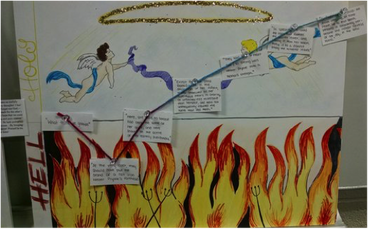 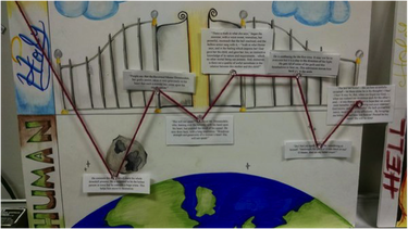 We did this over the course of a few days at the end of the novel, but I think it would be even better to introduce at the beginning of the novel and carry through. Variations could involve tracking the use of a particular symbol or even a particular kind of word. I’ve also had students chart multiple characters on the same chart. Why I like this:
Infographics Most simply, an infographic is a visual image such as a chart or diagram used to represent information or data. They use text combined with symbols and intentional color/sizing. This has become a pretty prevalent visual medium. Here is an example if you’re not sure what I’m talking about. I first started thinking about ways to use infographics after reading this article a couple of years ago. I experimented with some low tech options and then discovered some great websites that make this project stand out. I wanted the infographics to be more than a poster project. They had to create a visual argument. As such, I have a few very basic requirements when we create infographics:
Read more about my students' infographics after the jump... This year, my AP language class wrote research papers on 2016 presidential candidates. They chose one candidate and argued for him/her as the ideal candidate based on credibility, platforms and rhetoric. After writing their paper, they had to convey their argument in 200 words as an infographic. This word limit was challenging for some, but it made them focus on what was most essential to the argument. Using a visual medium, the students had to convey their argument in the form of an infographic. In the past, I’ve done similar assignments of the low tech variety (poster board and art supplies), or with Publisher or PowerPoint. This year, though, I discovered the website Piktochart and LOVED it. It is free and it is very user friendly. Students can start from preexisting templates or to create theirs from scratch. My students loved this website. The end product was fantastic and very professional. Below is part of a student’s chart. To see the full chart click here. 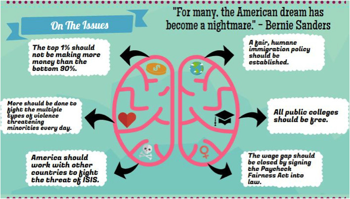 For a low-tech option, my sophomores did a similar assignment in which they had to visually present the argument from Goldstein’s book in 1984. The focus was still on visual argument as opposed to a lot of text. Below is one example: 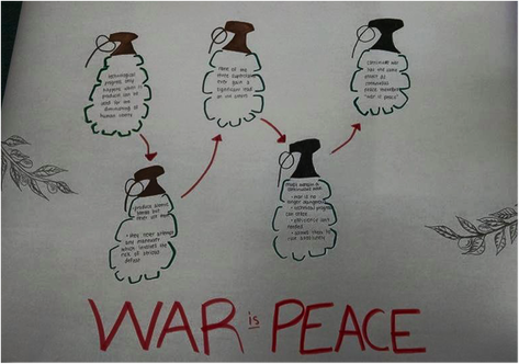 Why I like this:
What do you think? What have you done with visual argument in your classroom? How could you make something like this work in your own classroom? Leave us a comment, Tweet us your thoughts @WVCTE, or connect with us on Facebook! Jeni Gearhart teaches 10 Honors English and AP English Language at Hedgesville High School in Berkeley County and serves as a member of WVCTE's Executive Committee. Originally from Western PA, Jeni loves West Virginia and has taught all four years of her teaching career in the Wild and Wonderful state. She a not a hipster, but adamantly proclaims that she liked coloring books before they were cool. When not wandering the internet for new teaching ideas or grading papers, Jeni likes to drink coffee and devour good books.
2 Comments
Dalton Kendig
6/30/2016 11:57:57 am
YES! It's wonderful so read while I eat my Reese Puff's. We should've done more coloring books though. Leave a Reply. |
AuthorsMeet our contributing writers here! Archives
August 2017
Categories
All
|
 RSS Feed
