|
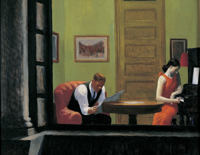
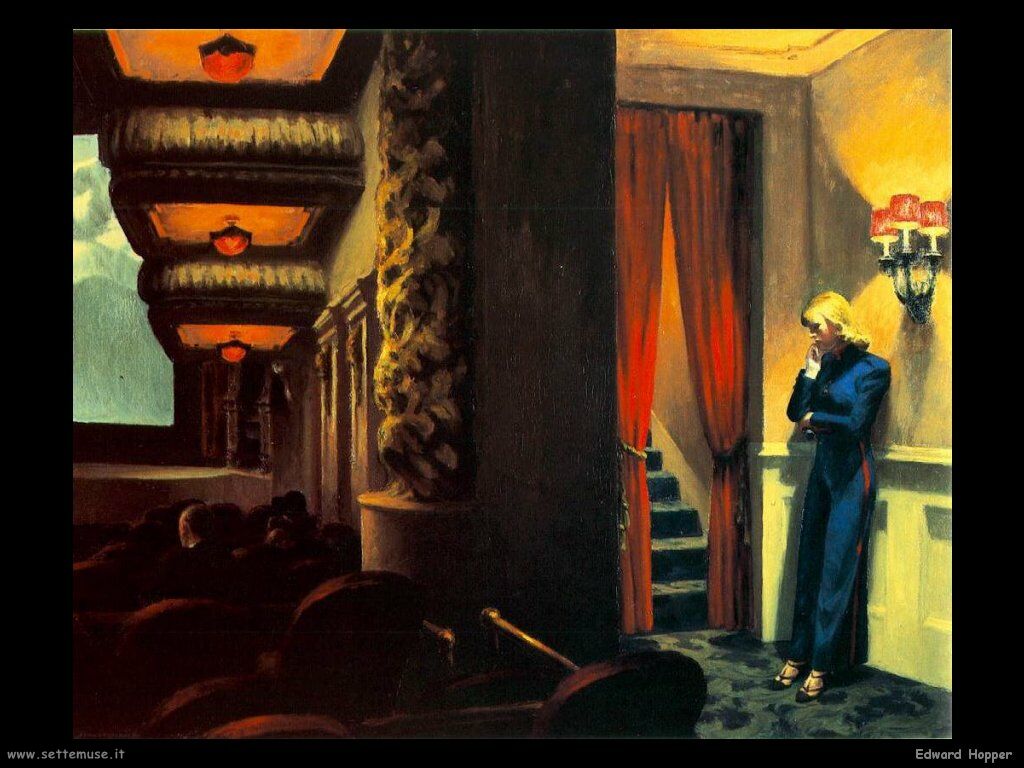
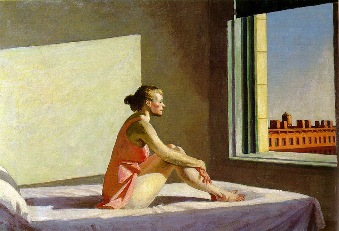
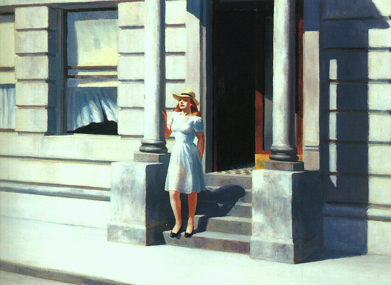
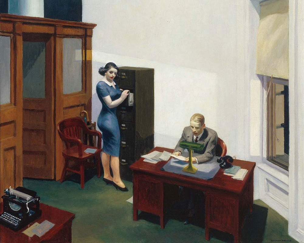
Our students live in a world saturated with images. The modern era of television, film, commercials, YouTube, Instagram, and infographics have made it necessary to make visual literacy and visual rhetoric and integral part of our ELA classrooms. And why not? The skills needed to analyze a political cartoon or artwork translate very well language analysis. An artist creates mood with color; a writer creates mood with adjectives. Is there a single figure in the frame? Is there a single idea being expressed in the text? Connecting these skill sets not only prepares our students to enter into a world that will inundate them with visual media, but also makes them stronger readers and writers. In my own classroom, I try to incorporate a visual component into every lesson, but my favorite visual literacy lesson combines poetry, argument, analysis, and two American treasures, Edward Hopper and Joyce Carol Oates. This lesson usually happens well into the school year, after we have laid a foundation for writing and making and supporting claims. I start by asking my students if art “can make an argument.” Student responses here will vary. A lot of students generally say “no”, but a few will say “yes”, and may reference political cartoons, or if they’re really hip, graffiti artists like Banksy. At this point I allow about 10-15 minutes of Socratic style discussion exploring ways that art can be “argument.” I try to lead my students into a conversation that connects author’s purpose to artist’s purpose. Then, I generally provide a few quick examples of photographers or artists who are making a clear claim about something. The iconic "Migrant Mother" photo below is a good example for this early discussion. Most students are familiar with both the photo and its context, and so it’s usually easy to make and then to identify the claims this photographer is making. 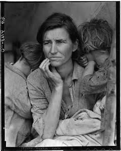 After this discussion, I display this painting by American painter, Edward Hopper. 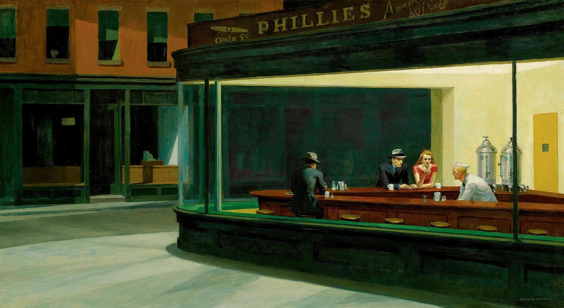 I set a timer for 5 minutes, and the students are to write down as many observations and/or inferences about the painting as they can. When the timer dings, I then tell them that the name of the painting is Nighthawks and it was painted in 1942. I give them another minute or two here to add to or clarify any of their observations. Students are then put in groups of 3 or 4. They have 15 minutes to share their observations and/or inferences, and decide as a group what claim(s) the artist is making. I usually leave the painting up during this time. When time is up, each group must share what conclusions they came to about the painting’s claim(s), and support this with evidence from the “text” (the painting). This introduction to the lesson usually 1-2 class days. The next day, I pass out copies of the poem “Nighthawks, 1942” by Joyce Carol Oates. Below is the full text of the poem. This poem is rich with imagery and figurative language. We read it together, and after we analyze the language effects, I ask the students if Oates has accurately analyzed the painting. Because essentially that is what her poem is—an analysis of Hopper’s artwork. Now, at this point most of our students have been trained to think about analytical writing as only essays and articles. The idea that analysis of a text or artwork can appear in the form of a poem, that you can make a claim about a work in poem form, appeals to them, especially the creative writers. What comes next is the coolest part. I give them a handout of other Hopper paintings. (See the slideshow below.) I use Hopper, not only because of the pairing of Nighthawks with the Oates poem, but because many of Hopper’s paintings are these beautiful, captured moments of time in which Hopper is making a clear claim about humanity, relationships, or the America of the 1940s and 50s. Students then have an exercise in imitation. They have to pick one of the Hopper paintings in the handout, and write a poem that analyzes the painting in the same way Oates analyzes Nighthawks. Their poem of analysis must be of comparable length to Oates’ poem, and they must imitate Joyce Carol Oates’ style, form, and language effects. I generally give them 2-3 “imitation goals” as well. For example in her poem, Oates references the female figure’s “pouty lip-sticked mouth.” We would have identified and discussed the adjectivalization of the word “lip-stick,” and one of their tasks in their own poems would be to make a noun that is not normally an adjective, an adjective. This poetry writing part of the lesson can be done in a day or in several days. I then have students share their poems in a Poetry Coffee House session. We have hot cocoa and cookies, I play music from the 40s and 50s, and as each student shares his or her poem, I project the painting the poem is analyzing on the board behind the student as he or she shares. It is by far one of the students’ favorite lessons of the year. And it’s one of my favorites because I get to show my students the connections between so many important skills: visual literacy, making clear claims, analysis, poetry, and critical thinking. This lesson is also the “kick-off” to their first research essay in which students pick a piece of art housed at the National Gallery in Washington, D.C. that they think is presenting an argument, and write their first formal research essay. In their research essays, students must present the argument they think the artist is making in the painting or photograph, then support this “claim about claim” with research and their own analysis. This also provides my students with an opportunity to spend the day in the National Gallery of Art. (And who doesn’t like a field trip, right?) So WVCTE is wondering… What types of visual literacy lessons do you use in your classroom? How do you connect visual literacy and visual rhetoric to writing? And how can you use and adapt this lesson for your own classroom? Jessica Salfia teaches AP English, English 11, Mythology, and Creative Writing at Spring Mills High School in Berkeley County, WV and also serves as an adjunct professor at Shepherd University in Shepherdstown, WV. Jessica is the President of WVCTE, an author, a poet, and was selected as the 2016 Berkeley County Teacher of the Year. When she's not teaching, writing, or rescuing shelter dogs, Jessica is probably with her three lovely children and husband at a baseball game. You can check out what Jessica is doing in her classroom by visiting www.salfiaenglishclass.weebly.com, or by following her on Twitter, @jessica_salfia.
0 Comments
By Jeni Gearhart I like color (and coloring books but that is beside the point). My classroom is covered in color from student projects. On occasion, my teaching wardrobe is too colorful. I say all of this because in the last few years, I have discovered the importance of visual argument in the classroom. Much of this new love of visual has come from AP workshops and creative teacher friends that I follow on Twitter. So, why is this important? If we use visuals well, it can become more than making a project “pretty”. It should be a part of the argument itself. In an increasingly visual society, students should be learning how to use the medium well (and understand how others are using it to influence them). Here are two things that I used this year that worked well. The first is low tech (hello art supplies!). The second is high tech but can be managed with art supplies if computers are inaccessible. Literary Fever Chart I originally read about this strategy in Write Like This by Kelly Gallagher (side note: if you haven’t read this book, find it now. His books are gold mines of great ideas). Essentially, a fever chart is a quote analysis that morphs into an analysis of a large theme in a text. It takes its original concept from medical fever charts documenting an individual’s changes in body temperature. For our purposes, it charts a character’s development. I used this in both my AP Language class and my sophomore class this year. In both cases, the students really got into it. This strategy works best to analyze the development of a theme over the course of a story, specifically in relation to an individual character. In my lesson from The Scarlet Letter, students chose one of the main characters (Hester, Dimmesdale, or Chillingworth) and charted the character’s move toward (or attitude towards) redemption (good) and damnation (evil). Here are the basic instructions:
  We did this over the course of a few days at the end of the novel, but I think it would be even better to introduce at the beginning of the novel and carry through. Variations could involve tracking the use of a particular symbol or even a particular kind of word. I’ve also had students chart multiple characters on the same chart. Why I like this:
Infographics Most simply, an infographic is a visual image such as a chart or diagram used to represent information or data. They use text combined with symbols and intentional color/sizing. This has become a pretty prevalent visual medium. Here is an example if you’re not sure what I’m talking about. I first started thinking about ways to use infographics after reading this article a couple of years ago. I experimented with some low tech options and then discovered some great websites that make this project stand out. I wanted the infographics to be more than a poster project. They had to create a visual argument. As such, I have a few very basic requirements when we create infographics:
Read more about my students' infographics after the jump... |
AuthorsMeet our contributing writers here! Archives
August 2017
Categories
All
|


 RSS Feed
